project_failure wrote:how about having just the logo on the shirt?
i believe it was lifeofbrian who suggested this in the other thread.
Yup. I suppose I'll just post the pics again:
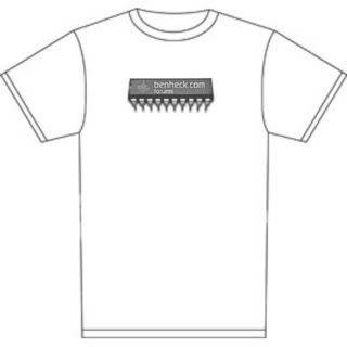
Design one:
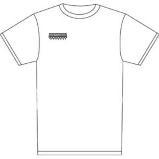
Design two (Some text on the back might look nice):
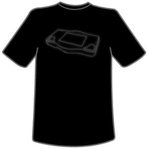
And I really like the portable outline, but I'm not digging the text. How about something more like this? Maybe put "benheck.com" or "benheck" in the screen area?
dragonhead wrote:sweet. ive spent a third of my life on benheck!
Yeah, I dig the subtlety. I wouldn't wear a "LOOK AT ME I'M PART OF SOME NERD THING YOU"VE NEVER HEARD OF WORLD@!!" T-Shirt. A cool Stencil Design (His SNESp was always my favourite layout) with an equally subtle standard light grey "Benheck" somewhere on it, preferably not too big..
Nicholai wrote:Hola, me llamo es Nicholai. Yo pienso que es tiempo para un nuevo logotipo.
(Sorry Spanish speaking peeps, for my poor knowledge. )
Use the subjunctive; es = vaya
I'd wear:
i would wear that too. No one would be like WTF is benheck, but they would obviously get that the portable is something tech related, and ask what it is.
I think it would make that shirt really hip to have a small version of Ben's signature underneath it (Having the B about the size of the closest wall). Also, it is too high up on the shirt. I would say lower it about 3 inches.
Dude put all these designs on cafe press call it benheck store line the income to ben's bank or paypal or whatever. presto we dont ever have to make the shirts alll we have to do is upload design and sell
Bass Creator wrote:Dude put all these designs on cafe press call it benheck store line the income to ben's bank or paypal or whatever. presto we dont ever have to make the shirts alll we have to do is upload design and sell